Design
Typography is the voice of your interface
The shapes, spacing, and rhythm of text quietly tell readers how to feel. A practical introduction to making type work harder.
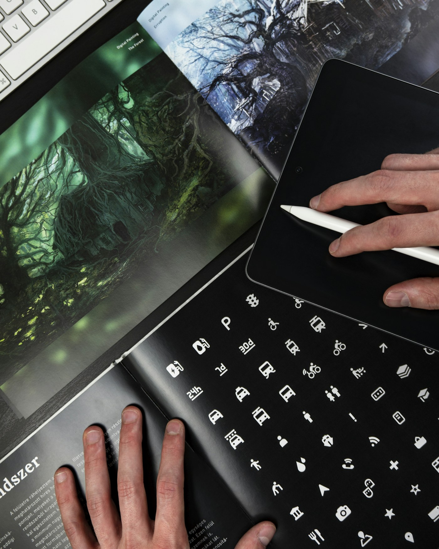
Before a reader understands a sentence, they experience its shape. Dense text may feel demanding, generous spacing may feel calm, and a playful heading may suggest a different kind of conversation. Typography sets expectations before the words do.
Build a restrained hierarchy
Choose a small number of sizes and give each one a job. Distinguish a title, a section heading, and supporting text through size and weight. Consistency makes the page easier to scan without turning every element into a competing announcement.
Let the paragraph breathe
Use a comfortable line length and enough leading to keep adjacent lines distinct. Test real paragraphs rather than a single attractive headline. A typeface that looks elegant at a large size may become tiring in sustained reading.
A better practice begins with one decision you can repeat.
Test the awkward cases
Long titles, zoomed text, and narrow screens reveal weak decisions. Avoid fixed heights on text containers. Good typography continues to support the message when the content refuses to fit the ideal example.
Try this today
- Notice one habit connected to this idea.
- Choose a small change that fits your circumstances.
- Write down what worked after a week.
Progress does not need to be dramatic to be real. Give the practice time, and let your own experience shape what comes next.
Related articles
Designing digital experiences that feel human
Good design starts with understanding. Why the most useful interfaces make room for real people, imperfect days, and small moments of delight.
The beauty of designing with constraints
A limited palette can open up better decisions. How boundaries bring clarity to creative work without narrowing ambition.
Join the conversation (0)
Share a thought. Be kind. All comments are reviewed before appearing.